The ATEC legislation passed the Senate yesterday, after the government accepted amendments from the Greens and David Pocock. It now needs to be rubber-stamped by the House of Representatives [update 9pm 31/3 – done] and the Governor-General [update 3/4 -done]. Once that is done, it will become law after 28 days [update – 29 April].
The amendments improve the legislation while still in my view leaving major flaws.
This previous post of mine links to my ATEC Senate inquiry submission and earlier posts on aspects of the legislation.
Objects of the Act
One of my criticisms was the entirely utilitarian and philistine set of ‘objects’ in the Act. While arguably no government since the 1970s has genuinely cared much about the broader functions of universities, they at least nodded to them in legislative objects. Not this government.
But the Senate amendment improves things:
Research
The ATEC bill read like a rushed committee job with nobody in enough control to ensure internal coherence. One example of this was research appearing in the objects of the bill but then disappearing from ATEC’s functions and matters on which it can give advice.
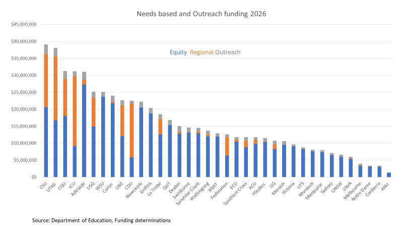
Last month I wrote about the new equity and regional needs based funding programs. Back then I had the funding formulas but not total funding amounts. The Department’s funding determinations now show that $425.7 million has been allocated for equity needs based funding and $118.6 million for regional needs based funding. There is also $43.7 million for outreach programs. The total is $588.1 million, including $1.3 million in equity needs based funding going to NUHEPs and private universities.
These new programs were principally funded from abolishing the old HEPPP equity program, the old regional loading, and the NPILF program, which supported internships and other engagement with industry. The predecessor programs were allocated $515.9 million, so the increase is more than indexation. Real cuts to the Commonwealth Grant Scheme may have funded the gap.
Funding by university
The chart below shows funding by university. Charles Sturt University and the University of Tasmania get the most money while the two Canberra universities get the least funding. They suffer from a lack of official ‘low SES’ areas in the ACT; as I noted earlier this month the low SES definition is not fit for funding purposes.
A spreadsheet of public university funding levels is available here.
In his speech to the Universities Australia conference last month Jason Clare complained that the low SES share of enrolments ‘hasn’t changed that much in the last 30 years.’ He is overly pessimistic about long run trends in low SES higher education participation. But after 2017 key indicators went backwards, until a recent stabilisation with signs of partial recovery. This post explores trends and speculates on causes.
School leaver participation
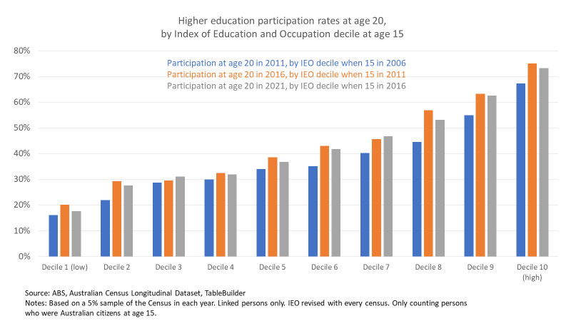
One issue with measuring trends in low SES enrolments is correctly identifying low SES students. In higher education statistics a person is low SES if from an area in the lowest 25% by the ABS Index of Education and Occupation. As charts below will show, this IEO geographic proxy shows a distinctive lowest 10% for higher education participation. Above that, however, we see modest participation and attainment increments between deciles 2-6, with differences then speeding up to a distinctive top 20%.
The participation rate similarity between deciles 2-6 makes the current low SES definition unsuitable for funding purposes, but a reasonable rough guide to overall trends. Because deciles 2-6 are sociologically similar, they probably respond in similar ways to economic, educational and policy trends affecting higher education enrolments.
In his speech, the minister referred to an enrolment share metric, low SES students/all domestic students. That’s administratively convenient but analytically weak, as low SES results depend as much on movements in middle and high SES as low SES enrolments. Participation rates are better measures, low SES higher education students/low SES population.
The chart below uses census longitudinal data for school leavers, taking as their SES the IEO ranking of where they lived when they were 15 years old, to better capture the social context of their secondary school years. The orange bars show that in 2016 all deciles had increased their participation rates since 2011, facilitated by the demand driven funding system. But in 2021, shown in grey bars, the participation rate in most deciles was lower than in 2016. There may be some statistical noise. This dataset takes a 5% sample of the census and my results omit unlinked census records – meaning the ABS could not track the same person from census to census or the necessary data was missing. But other data reported in this post confirms that the overall trend is real, even if some decile results are not 100% accurate.